Two Open Rate Drivers That Too Many Email Marketers Are Overlooking
Published on January 18, 2017/Last edited on January 18, 2017/4 min read


Team Braze
As an email marketer, I spend a lot of time talking to other industry professionals. A common refrain among metric-driven marketers is to lament over lackluster open rates. This frustration tends to peak around the holidays when promotional content increases by about 30%, flooding inboxes. Email teams spend valuable time creating engaging and relevant content only to have a small portion of the list population open the email.
Considering how commonplace this complaint seems to be, I was surprised in a recent forum conversation to find that the majority of email marketers were relying solely on subject lines to drive opens, and either forgetting or neglecting two very important inbox elements that have a major impact on open rates.
1. Preheader text (The Johnson Box)
Preheader text, also known as the ‘Johnson Box’ is the summary text that precedes the subject line in the email inbox. This little slice of inbox real estate is a valuable element that can have a major impact on email open rate.
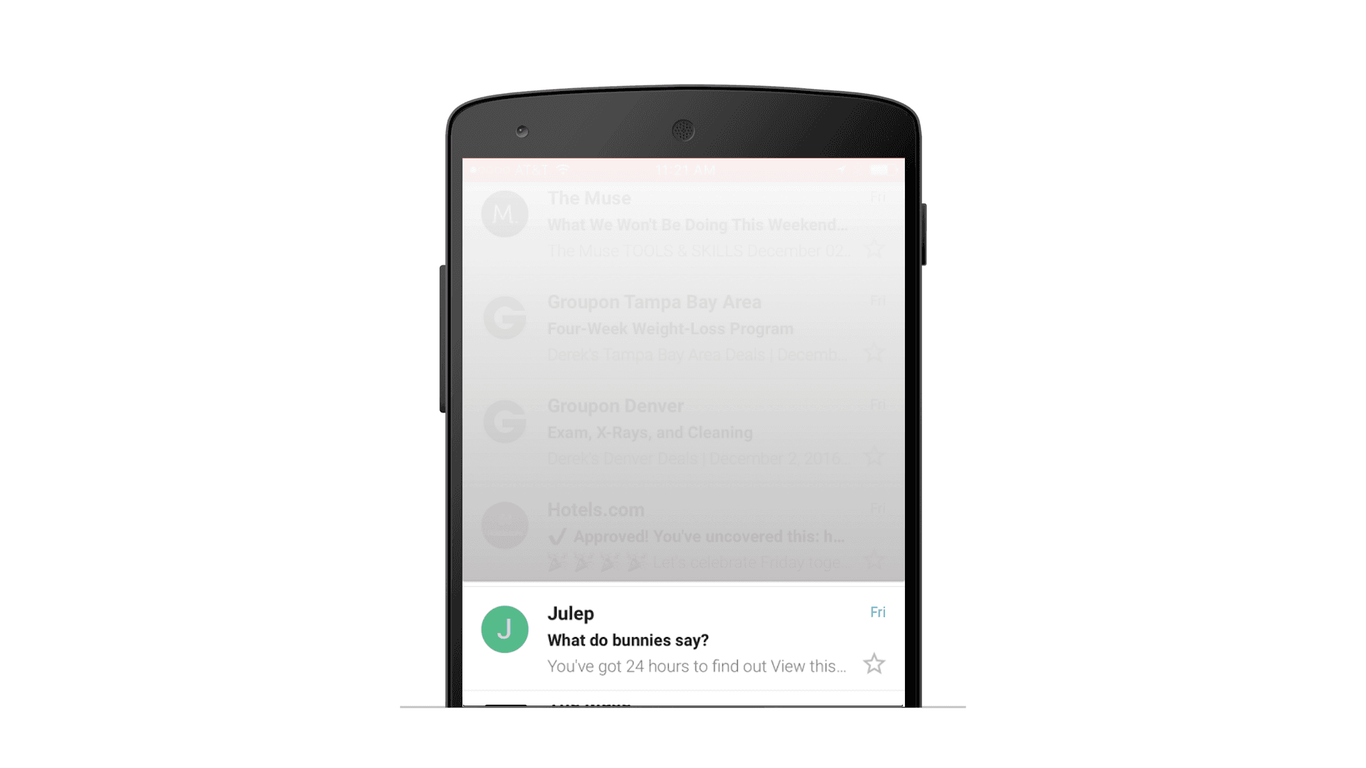
An email from Julep featuring preheader text
Skim your promotions inbox and you’ll find both emerging and established brands blowing this opportunity to connect with subscribers by displaying links full of tracking parameters or generic header image alt-text. This is at best a missed opportunity to entice a user to open; at worst this is an instant turnoff that can lead to an unsubscribe or spam report.
In my experience, optimizing preheader text can increase total open rate by about 8%.
2. Visible from name (Sender)
The personalization rush has been in full force for a few years. While we all push to create user level personalized content, it’s important not to forget that personalization is most impactful when sent from a brand with a clear voice and a human personality. This is amplified when considering that the majority of emails are opened in a crowded mobile inbox, which are quickly scanned while a user decides whether to open the email.
To break through this noise, use thoughtful and deliberate sender names to which a subscriber can relate. When testing sender names, make sure that the content in the email is relevant to the sender name so that subscribers know what to expect before they open the email from a unique sender.
In my testing, optimizing the sender name can increase total open rate by about 17%.
Best-in-class
The good news is that there are many brands who continue to test sender, pre-header text, and subject lines that can serve as a springboard to help kick off your testing. The following are best-in-class examples from brands that are winning the inbox.
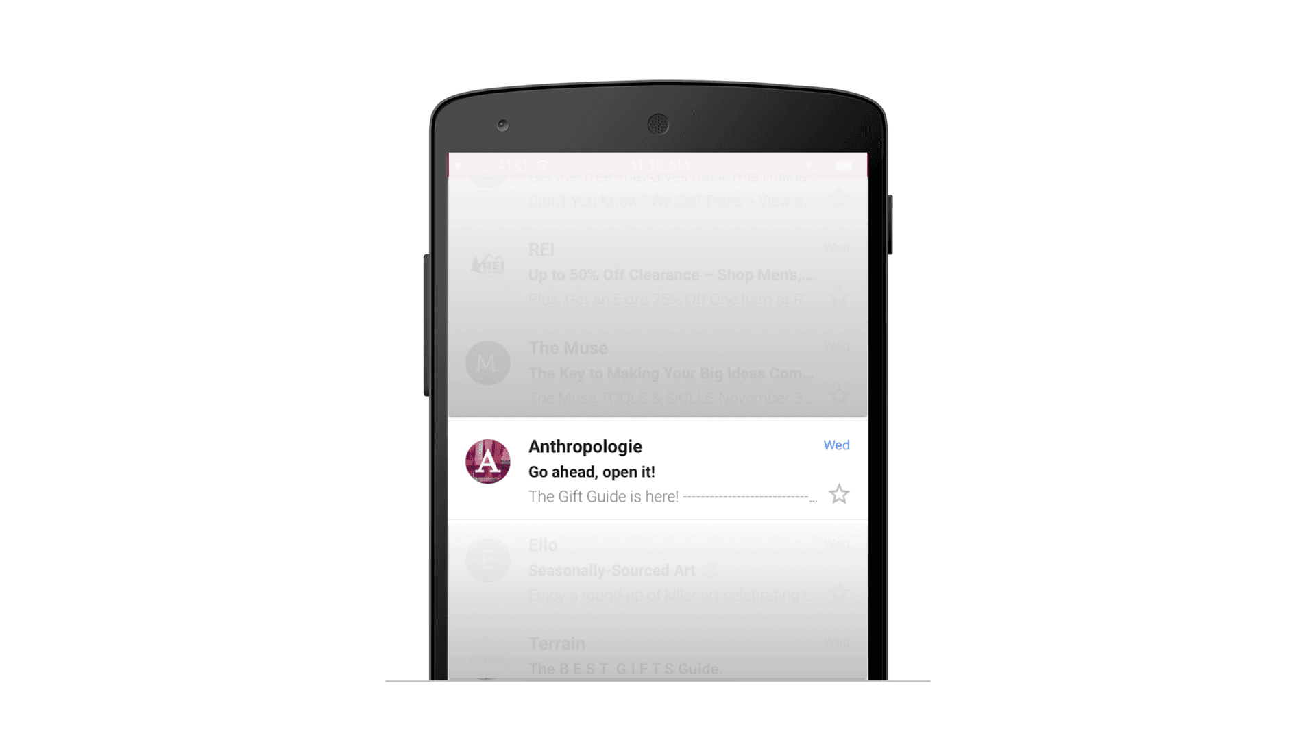
Anthropologie
Why? Less is more
Anthropologie relies on the context of the preheader text to pay off the subject line. They also creatively use dashes to ensure that no additional text gets in the way of their short, sweet, and impactful execution.
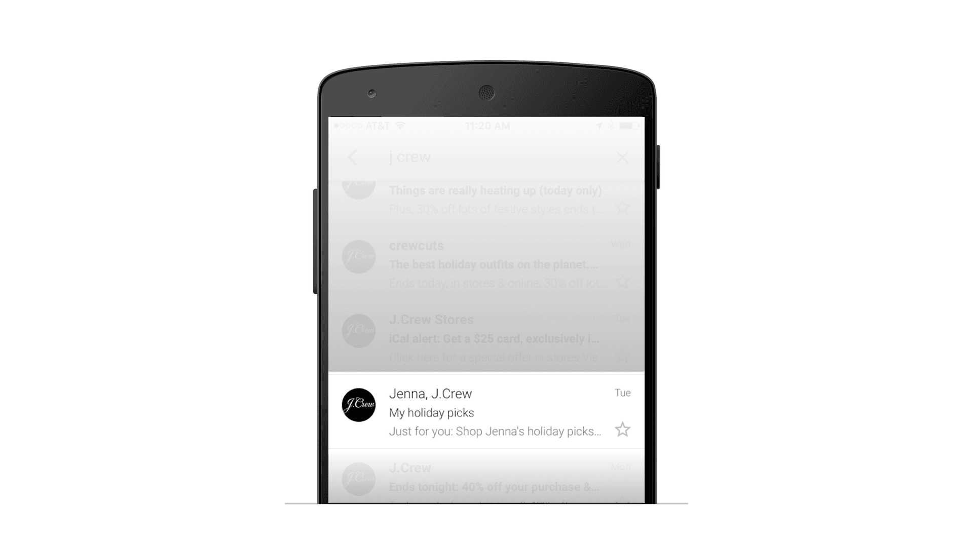
J. Crew
Why? Personal and human
Crew’s email team has been on top of their game for a while now. In the holiday torrent of emails, seeing a humanized message from a brand stands out in the inbox. After opening, the email content supports the sender name and preheader text—containing a mixture of curated and recommended products based on purchase history.
Ibotta
Why? Message clarity
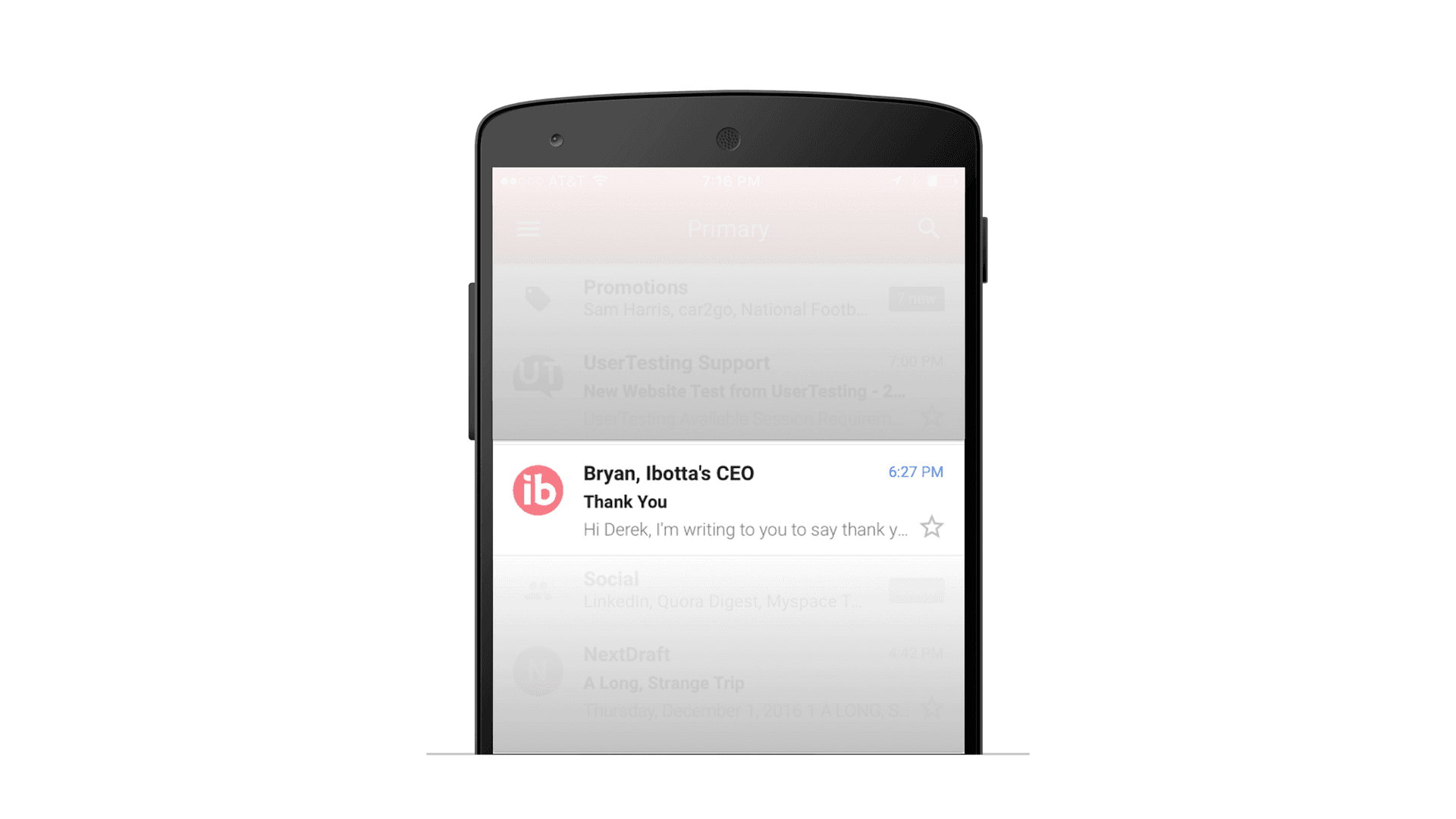
This is a thank you letter from our CEO, we set the preheader text entices the subscriber to open the email to learn why they are being thanked.
Bonus: Try this emoji test
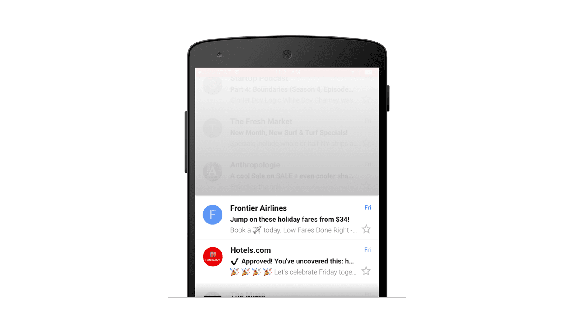
Many brands have been moving emojis from the subject line into the preheader text. This tends to give the subject line more impact and also pulls the attention to the preheader text, giving the brand an extra chance to garner attention and opens. This seems particularly impactful on desktop, where the preheader section becomes a sea of light gray text.
Have you mastered pre-header text and sender name optimization? If so, tweet us your insights.
Be Absolutely Engaging.™
Sign up for regular updates from Braze.

