Sign-up form examples: Proven designs and best practices to grow your list faster
Published on January 29, 2026/Last edited on March 11, 2026/25 min read

Team Braze
Contents
Time and again, brands work hard at building a fantastic website and engaging emails, but forget about the step in between—the sign-up form. How you entice people to hand over their details at that last point is largely about trust and there’s still work to be done to avoid losing people at that stage.
So let’s look at some sign-up form examples—ones that perform better for stronger onboarding and engagement across channels over time. After reading this guide, you’ll be confident in what to include in a sign-up form, and what to optimize and test. Your sign-up forms can be the gateway to lifecycle personalization, so let’s get you started on that path.
TL;DR
- High-performing sign-up forms match the offer to user intent and keep the first step simple.
- Email and SMS sign-ups serve different lifecycle roles and work best when introduced in stages.
- The most effective forms collect only data that supports segmentation, onboarding, and personalization.
What is a sign-up form?
A sign-up form is a website element that collects contact information, such as an email address and/or phone number, in exchange for value, so brands can communicate with visitors through owned channels.
Because it is often the first place that a customer is handing over details about themselves, the sign-up form sets the tone for what customers expect, the value they’ll receive in connecting with you, the relevance and alignment of your communication with them, and even their engagement and conversion rate across the customer journey. So explicit consent and trust matter hugely from this first interaction.
Email vs SMS sign-up forms
Alongside email sign-up forms, SMS opt-ins can be offered too. They tend to serve different purposes, with email sign-ups supporting richer storytelling—used for onboarding, education, product discovery, and longer lifecycle messaging. SMS sign-ups have more urgency. Shipping alerts, back-in-stock, time-bound offers, appointment reminders, and account updates are some of the messaging more suited to this channel.
High-performing sign-up form examples by goal
Discount or offer-driven sign-up form
A discount-led sign-up form works best when the offer matches intent, the ask is light, and the follow-up journey delivers value fast.
Example 1: The classic welcome offer
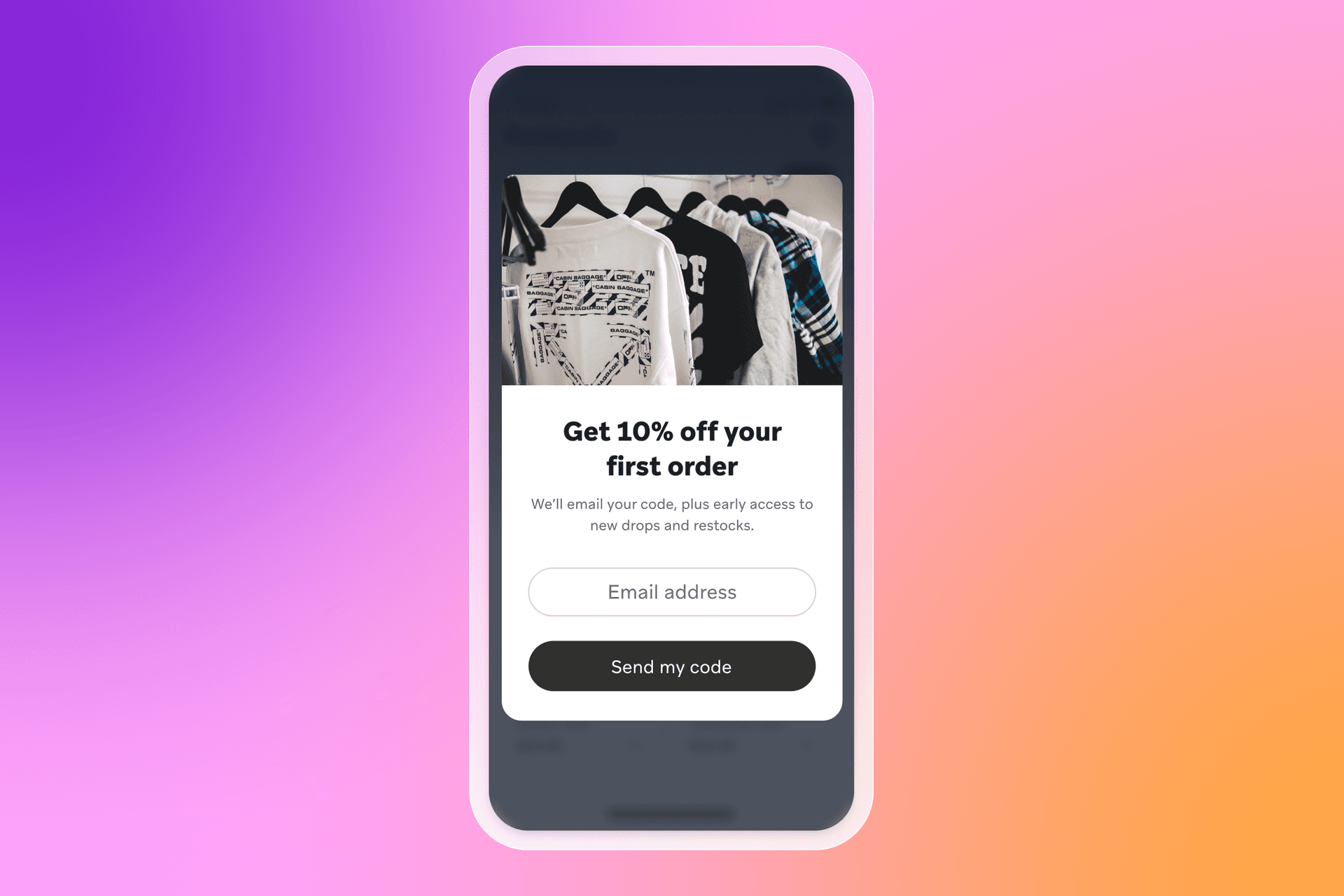
What the form offers: 10%–15% off the first order, or free shipping on the first purchase.
Why it works: It’s a simple trade—contact details for a clear, immediate perk. It also gives you a clean starting point for onboarding, where email can handle product discovery and education, and SMS can be offered later for alerts.
When to use it: Use this on homepages, collection pages, and first-session visits when you want to convert new traffic into customer acquisition quickly.
Example 2: Intent-matched category offer
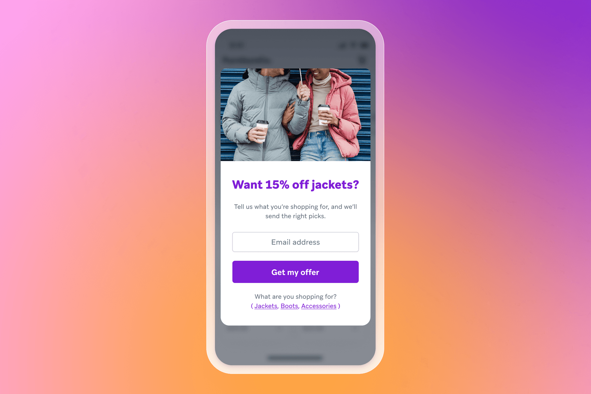
What the form offers: A discount tied to the category someone cares about (for example, “15% off jackets”).
Why it works: It reduces irrelevance. A category-specific offer performs better when it matches what the visitor is trying to do, and it creates an early segmentation signal you can use in the welcome journey.
When to use it: Use this on high-traffic category pages, seasonal collections, or ad landing pages where you already know the theme.
Example 3: Offer plus preference “micro yes”
What the form offers: A two-step offer that starts with a simple yes/no and follows with the opt-in field.
Why it works: The first click is low effort and builds momentum. The second step captures the email address after the visitor has already agreed they want the value.
When to use it: Use this for pop-ups where you want a lighter first interaction, or when you’ve seen single-step forms struggle on mobile.
A giveaway form can drive volume fast. The key is to qualify early, set expectations, and route people into onboarding that builds intent after the opt-in.
Giveaway or contest sign-up form
Example 1: Simple giveaway entry
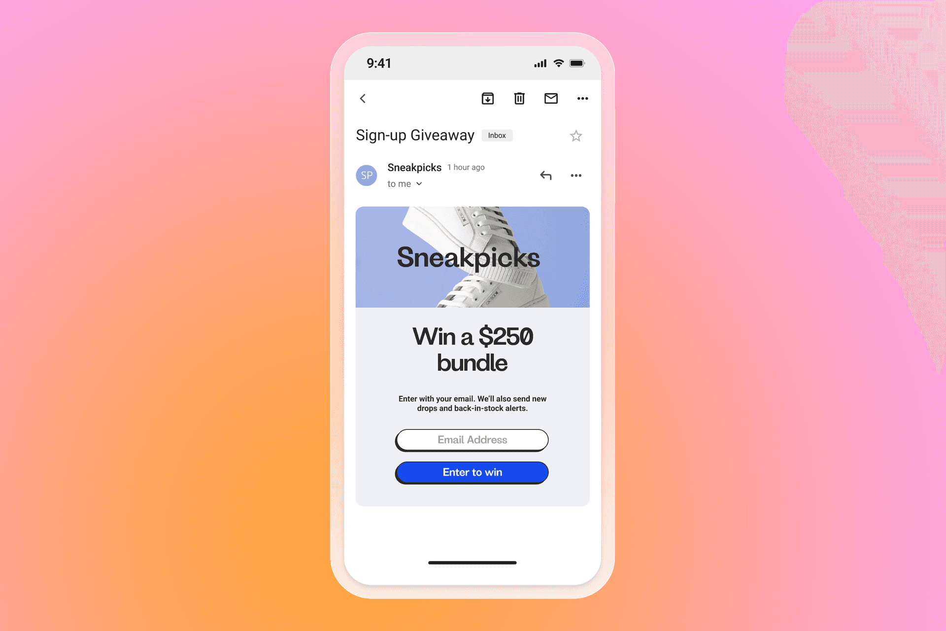
What the form offers: Entry to win a product bundle, a gift card, or a limited-edition drop.
Why it works: The value is clear, and the action is quick. It’s also a strong way to grow lists during launches, seasonal moments, or collaborations.
When to use it: Use this when you want a short-term burst of customer acquisition and you have a plan to nurture new contacts after the giveaway ends.
Example 2: Giveaway with built-in qualification
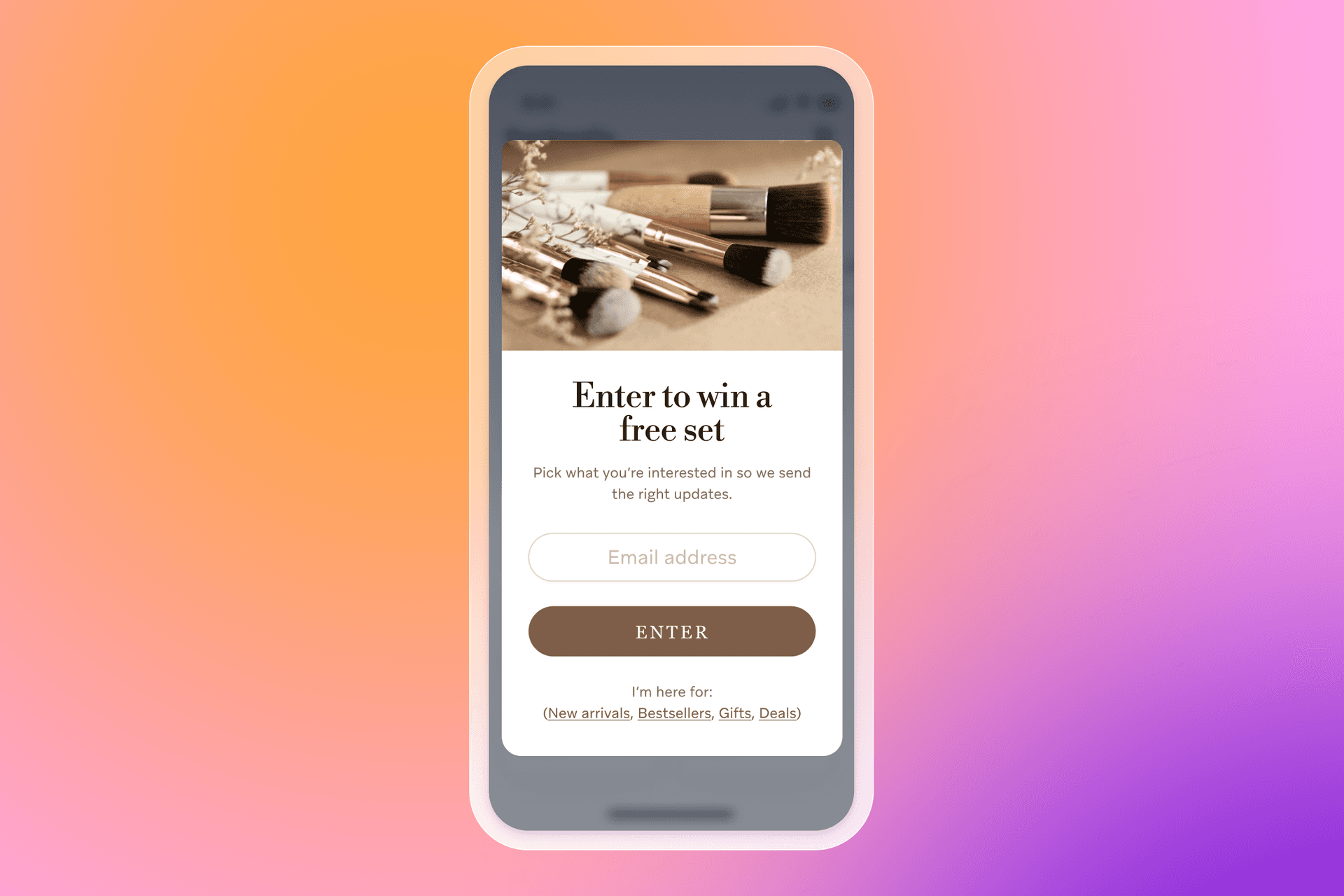
What the form offers: Entry to win, plus a small “tell us what you’re into” step.
Why it works: Giveaways can attract low-intent sign-ups. One preference question helps you segment from day one, so your welcome flow stays relevant and you can nurture toward first conversion.
When to use it: Use this when you sell across distinct product lines or audiences and irrelevant follow-up would hurt trust.
Example 3: Countdown giveaway for urgency
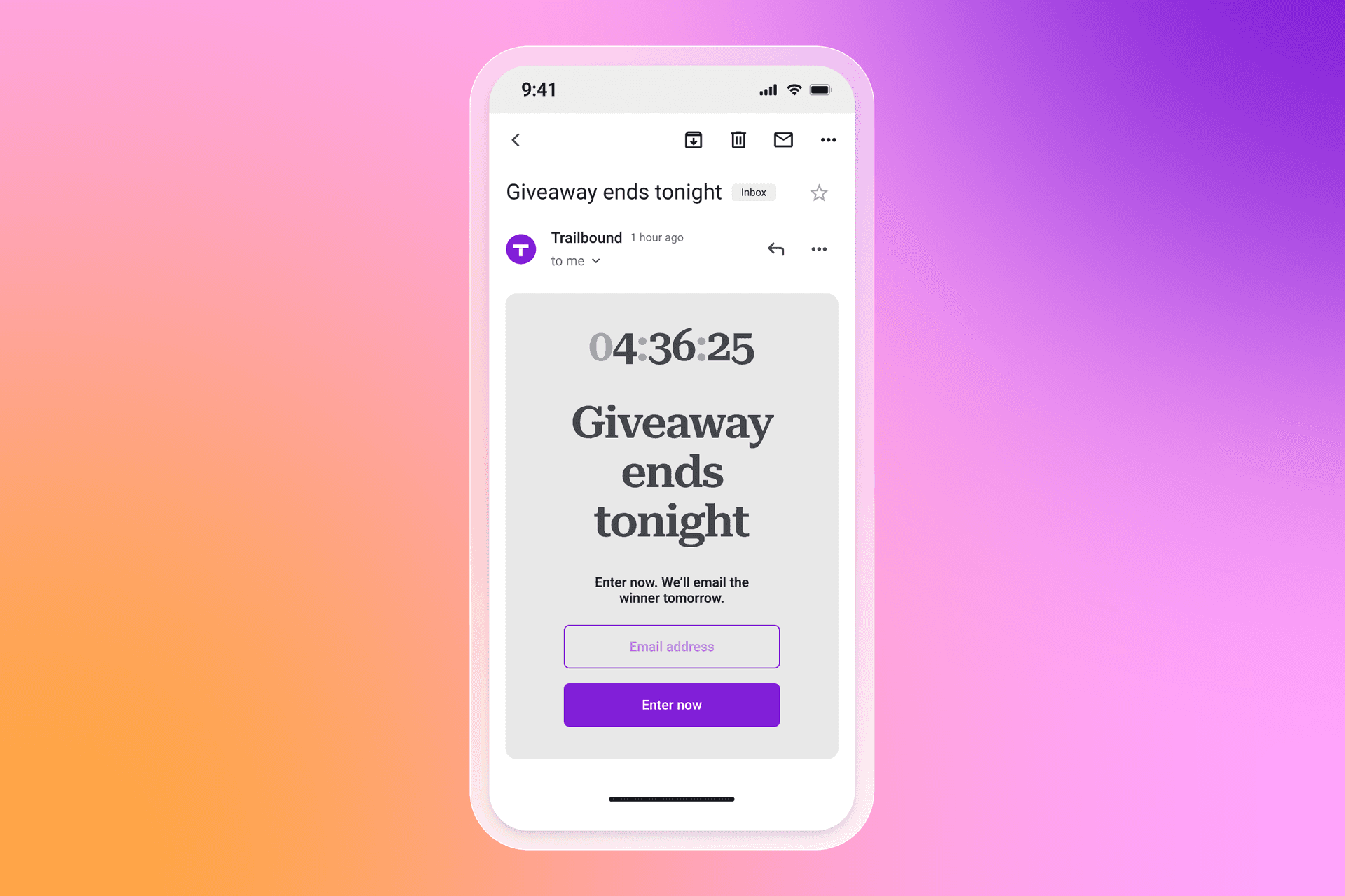
What the form offers: A time-bound entry window with a visible deadline.
Why it works: A deadline creates urgency, which can lift conversion rate. It also gives you a clear follow-up moment when the giveaway closes, which is useful for onboarding.
When to use it: Use this during seasonal peaks, live launches, or event-led campaigns.
Content or resource-based sign-up form
Resource-led forms are great when you want higher-quality opt-ins and a natural way to collect zero-party data. The content itself sets up onboarding, segmentation, and future personalization.
Example 1: Gated guide or checklist
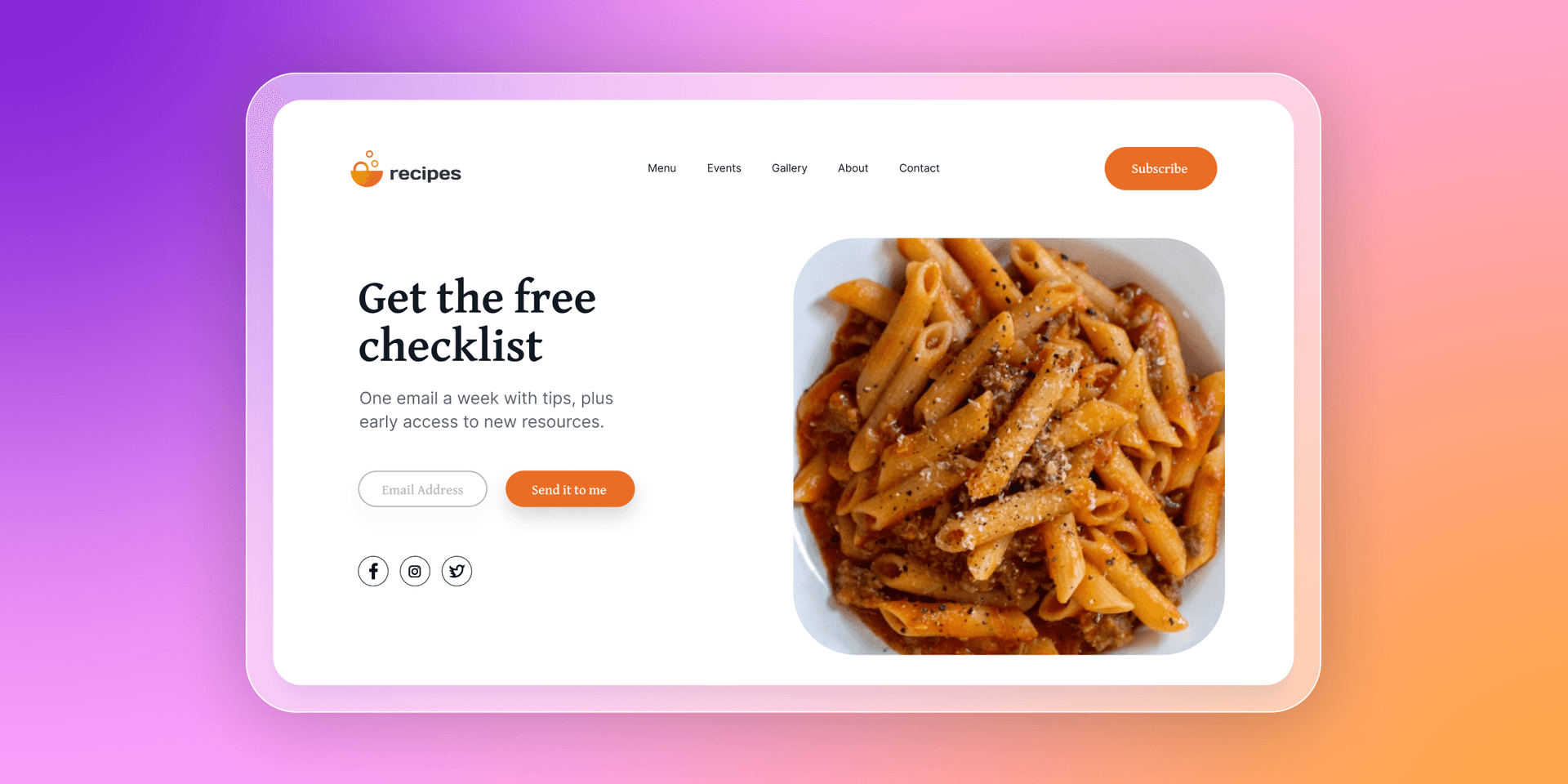
What the form offers: A downloadable guide, checklist, template, or planner.
Why it works: It attracts people looking for help, which tends to signal higher intent. It also supports personalization because the topic tells you what the subscriber cares about.
When to use it: Use this on blog posts, SEO landing pages, and educational hubs, especially for considered purchases or complex catalogs.
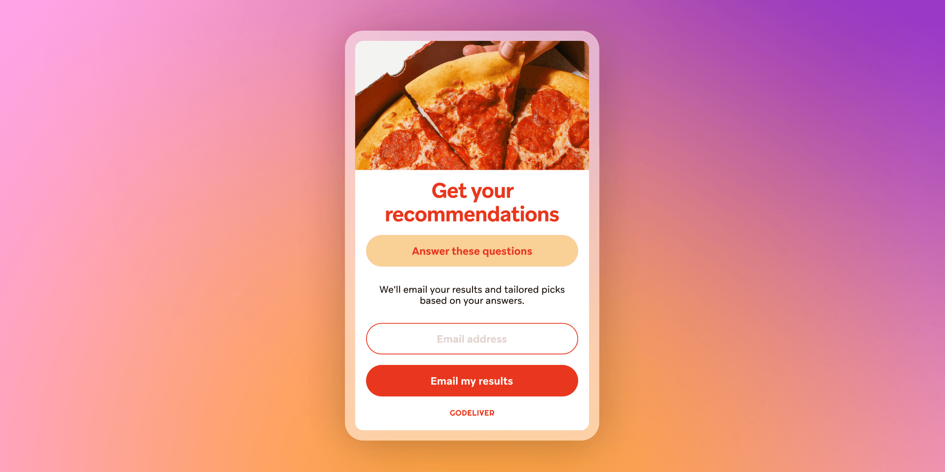
Example 2: Quiz or finder with results by email
What the form offers: Quiz results, recommendations, or a personalized plan delivered via email.
Why it works: Quizzes naturally collect zero-party data. That gives you a strong segmentation foundation for tailored onboarding and product discovery.
When to use it: Use this when customers benefit from guidance: routines, bundles, subscriptions, sizing, gift finding, or multi-SKU decisions.
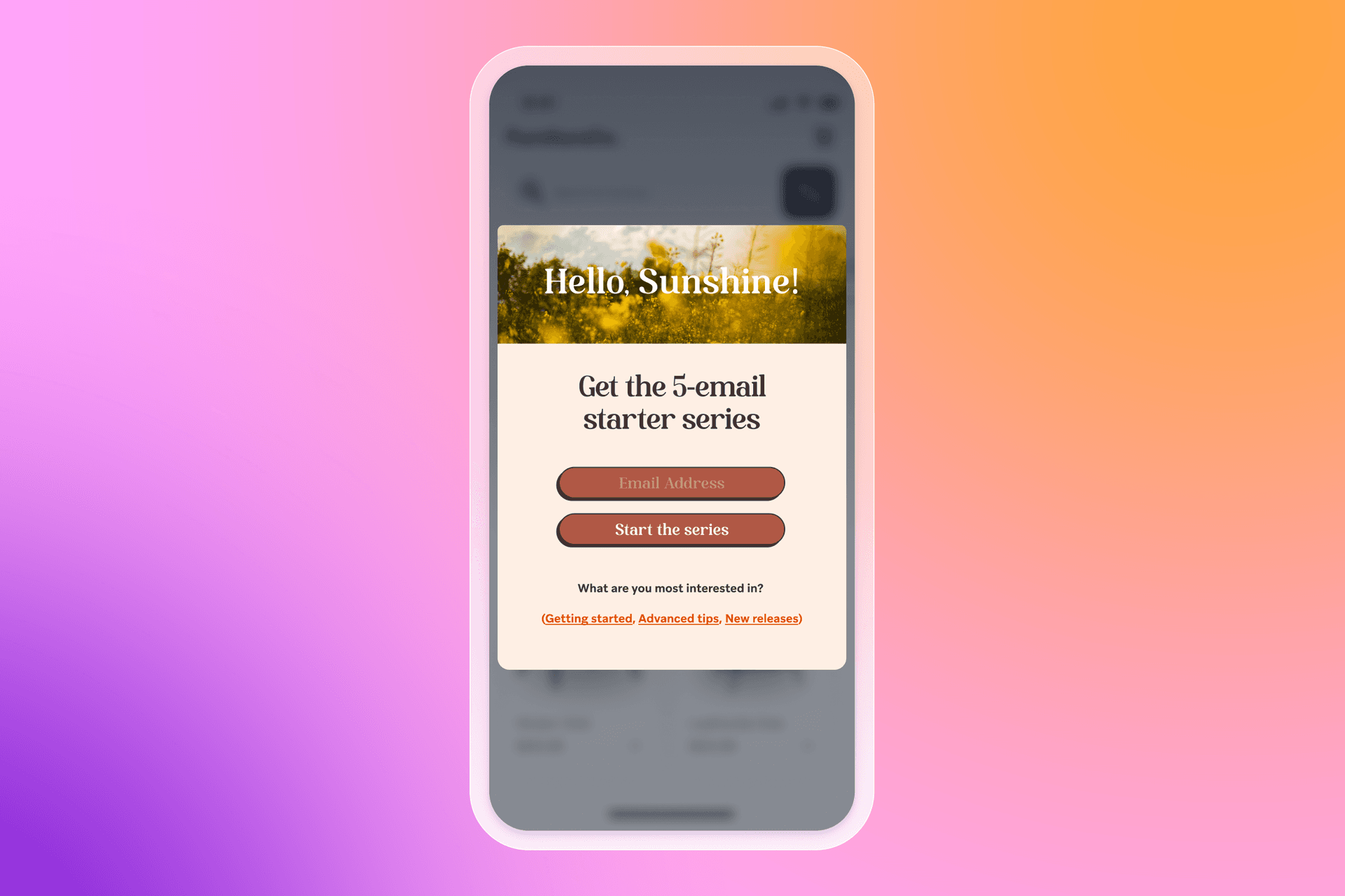
Example 3: Educational series opt-in
What the form offers: A short email series: “5-day starter series,” “7 tips,” or “weekly lessons.”
Why it works: It sets clear expectations around content and frequency, which builds trust. It also creates a welcome journey that feels useful from the first message.
When to use it: Use this when you want to build consideration, reduce churn, or support onboarding for subscriptions, memberships, or higher-AOV products.
Website sign-up form examples: 13 best practices that improve conversion
The best website sign-up form examples share the same fundamentals—clear value, minimal friction, and data you will actually activate.
1. Align the offer with the form’s goal
If your goal is to drive purchases, your sign-up offer should make buying easier. That usually means a purchase-related incentive like a discount, free shipping, or a free gift. It gets even stronger when the offer matches someone’s intent. A sitewide “20% off everything” is broadly useful, but an offer tied to a specific category can miss the mark if it doesn’t match what the person came for. If someone’s here for a new jacket, “20% off shoes” won’t help them take the next step.
Treat every field you ask for as a trade. If the value is clear, people opt in. If it’s vague, they bounce.
- Do this: Tie the incentive to one clear outcome (first order, early access, content series), and match it to the intent you’re seeing (category interest, on-site behavior, or entry page).
- Capture this: Email address (to deliver the offer and start the welcome series). If you want to tailor the incentive, add one preference field like “What are you shopping for?” (to route the subscriber into the right onboarding path and personalize early product discovery).
2. Avoid one-size-fits-all forms
A one-size-fits-all sign-up form is a fast way to waste good traffic. People land on different parts of your site with different intent, so the form they see should match why they’re there.
First-time visitors are often worth prompting with a general welcome offer. After that, tailor by context. Someone reading a blog post is usually looking for guidance or ideas, while someone on a product page is closer to choosing what to buy. The same pop-up and incentive won’t speak to both.
You can also tailor by source. If a visitor comes in from a paid social campaign promoting a specific resource, show a form that matches that campaign and suppress your generic sitewide pop-up.
The one watch-out: if you run multiple forms, plan your rules so they don’t collide. Competing pop-ups create friction, and that hurts conversion rate and trust.
- Do this: Target forms by entry point and intent (blog vs. product pages, new vs. returning visitors, campaign landing pages, or key behaviors like exit intent). Set suppression rules so people don’t get hit with multiple prompts in one session.
- Capture this: Email address (to start the right welcome path). Add traffic source or entry page context as an attribute (to personalize onboarding and reporting), and optionally one intent field like “What are you here for today?” (to route people into content-led vs. purchase-led lifecycle messaging).
3. Emphasize the value proposition clearly
Once you know what you’re offering in exchange for someone’s details, put that value front and center. People should not have to hunt for the “why” in your headline, subhead, or button copy.
This is where a lot of forms fall down. The design might be polished, but the message is vague. If the offer is a discount, say the discount. If it’s early access, say what they get early access to. If it’s a resource, name the resource and the outcome it helps with. Clarity builds trust, and it usually lifts conversion rate because visitors can make a quick, confident choice.
- Do this: Put the value in the headline, keep the supporting copy to one short line, and make the CTA match the promise (for example, “Get the code,” “Send me the guide,” or “Unlock early access”).
- Capture this: Email address or phone number (to deliver the promised value immediately). If you’re offering multiple options, add one intent field like “What are you interested in?” (to personalize the first messages in your welcome journey and avoid sending irrelevant offers).
4. Set expectations around content and frequency
People want to know what happens after the opt-in, especially if you’re collecting both email and SMS.
Spell it out in plain language. Tell email subscribers what kinds of messages they’ll get (tips, product drops, restocks, back-in-stock, events), tell SMS subscribers what texts will cover (alerts, early access, delivery updates), and set a rough idea of how often you’ll be in touch. A simple reassurance that they can opt out at any time also goes a long way.
This is also a trust moment. When you’re clear about consent, how you’ll use the information, and where people can read your privacy policy, you get higher-quality opt-ins, and a healthier lifecycle program.
- Do this: Add one short line that covers message type, how often you’ll message, and opt-out. Include links to your privacy policy and terms when relevant, and keep SMS consent language explicit.
- Capture this: Channel preference (email, SMS, or both) to shape the welcome journey. For SMS, capture explicit SMS consent (to meet consent requirements and protect deliverability). If you’re offering different content streams, capture one preference choice (to personalize onboarding and reduce early unsubscribes).
5. Keep the initial form simple
The job of the form is to make the decision easy, and the fastest way to do that is to remove friction.
Ask for one thing upfront—an email address, or a phone number. Every extra field is another reason to abandon the form, including “nice to have” details like first name. If you earn the opt-in, you can collect richer profile data later through onboarding, preference centers, quizzes, account creation, checkout, and on-site behavior.
- Do this: Keep the first screen to one field and one clear CTA. If you want both channels, collect email first, then ask for SMS on the next step.
- Capture this: Email address (to start the welcome journey and deliver the offer). Add phone number only in a second step (to expand into SMS). Save name and other profile fields for later touchpoints where there’s more trust and a clearer reason to ask.
6. Ask for more data only when it adds value
Keep the first step simple, but add one extra question when it makes the next messages more relevant.
This is key when you serve distinct audiences. One preference question can route someone into the right onboarding path and prevent irrelevant messaging.
More fields can lower sign-ups, so treat this like an experiment. Keep the question if it improves downstream engagement, and remove it if it doesn’t.
- Do this: Add one optional question only when it changes the welcome journey, and remove anything you can’t activate in lifecycle messaging. Test the impact on opt-ins and welcome engagement.
- Capture this: One preference field like product interest, shopping goal, or message preferences (to segment subscribers from day one and personalize onboarding). If relevant, capture birthday (to support a birthday journey) or a frequency preference (to reduce early opt-outs).
7. Use zero- and first-party data intentionally
Zero-party data is information someone shares intentionally, like a preference they choose in a survey, quiz, or sign-up form. First-party data is information you collect directly through your own platforms and channels, like the pages they view, the products they browse, or what they do after they opt in.
Collect these signals with a plan. If a data point won’t change what you send, when you send it, or which channel you use, it’s probably not worth adding to the form. If it helps you tailor onboarding, recommendations, and lifecycle messaging, it can be worth a small amount of extra effort from the subscriber.
- Do this: Decide how each data point will be used before you add it. Use zero-party data to route the welcome journey, then layer in first-party behavior to refine personalization over time.
- Capture this: Product interest (to personalize onboarding content and offers), message preferences like channel choice and “how often” (to reduce opt-outs), and key behaviors like categories browsed or items viewed (to trigger follow-ups, recommendations, and replenishment journeys).
8. Segment audiences from the start
The information someone shares on a sign-up form can be saved to their customer profile as attributes. That gives you a clean way to start segmentation early, tailor message content, and shape product discovery from the first touch.
This is especially useful when you have distinct audiences, product lines, or use cases. One preference question can help you avoid sending irrelevant content, which protects trust and keeps engagement higher as the lifecycle program matures.
- Do this: Turn form responses into 2–4 starter segments, then route each segment into a slightly different welcome path. Keep it simple at first, and refine with behavior over time.
- Capture this: Product interest (to personalize onboarding and recommendations), what matters most like price, quality, or sustainability (to tailor content angles), and message frequency preference (to reduce early opt-outs).
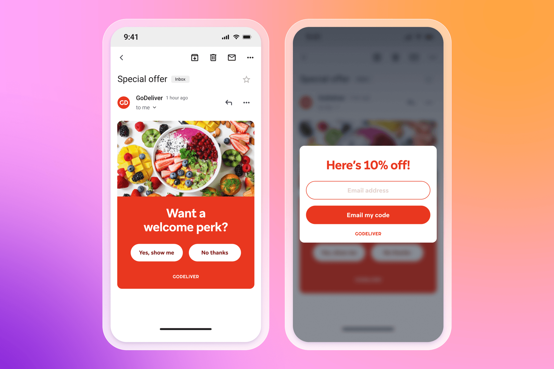
9. Use multi-step forms strategically (“micro yes”)
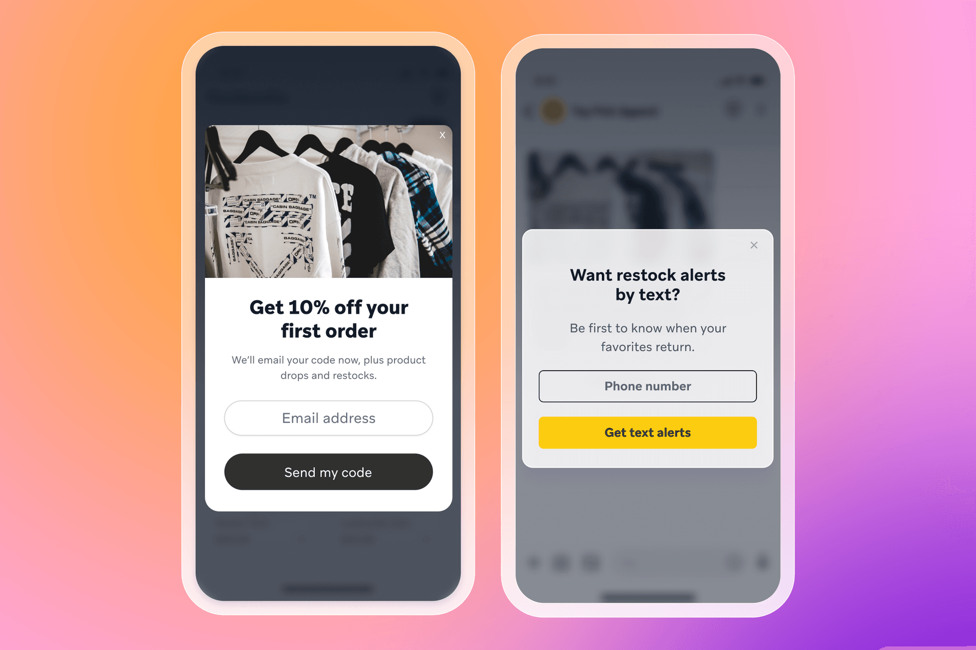
Multi-step forms can feel easier to complete because each step is small. Instead of dropping a field in front of someone straight away, you can lead with a simple question that gets them to raise their hand, then ask for their details on the next screen.
This is the “micro yes.” Ask a low-friction question first, like “Want 10% off?” or “Get restock alerts?” Clicking yes is a tiny commitment. The next step, sharing an email address or phone number, feels more natural because the visitor has already agreed they want the value.
- Do this: Use a two-step flow: step one confirms interest in the offer, step two collects the contact detail. Keep the first step to a simple yes/no or single tap option.
- Capture this: Email address on step two (to deliver the offer and start onboarding). If you need a preference signal, capture one intent choice on step one (to route the subscriber into the right welcome path).
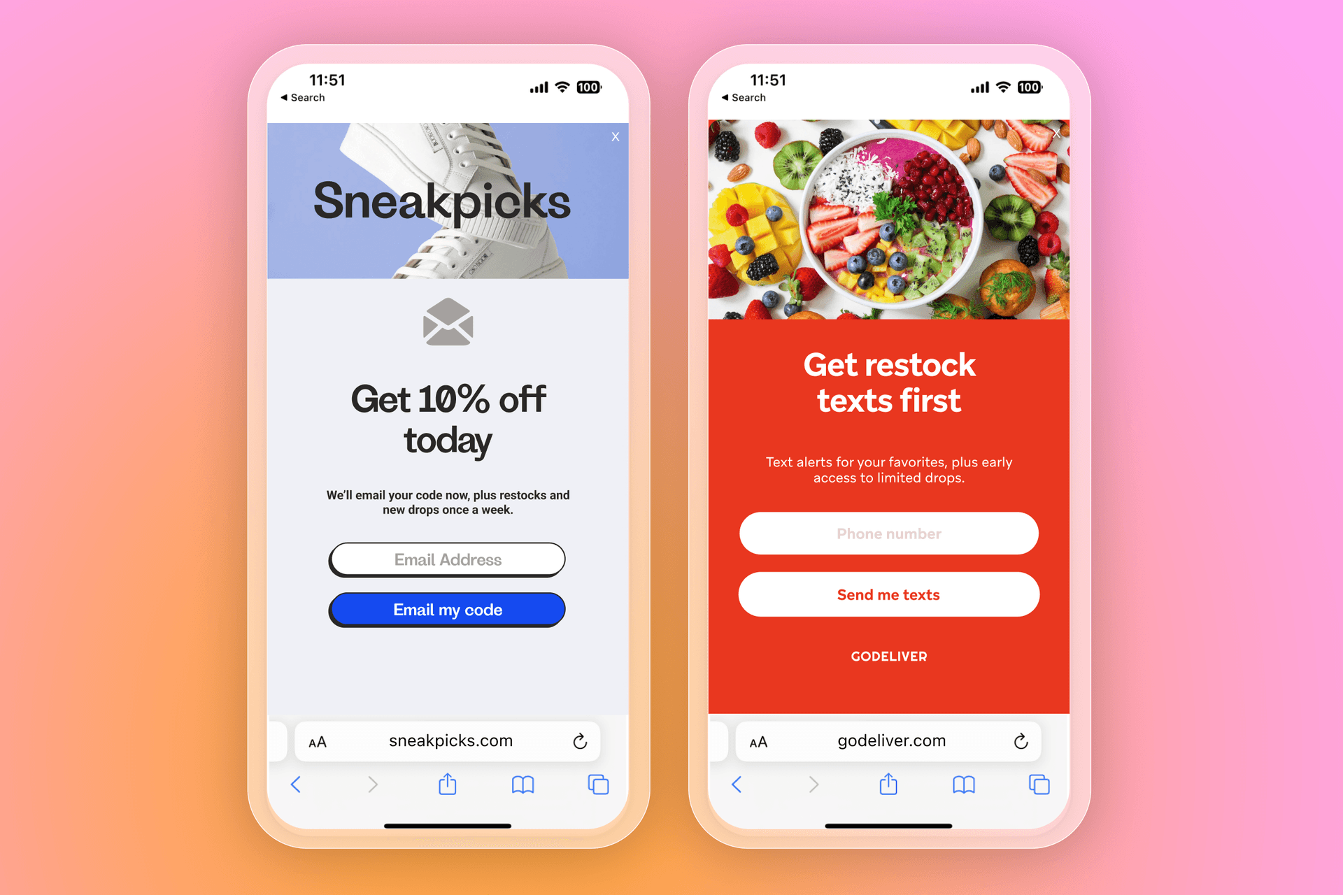
10. Collect email first, then SMS
Once you’re using a multi-step form, one of the most effective sequences is email first, then SMS. The first step collects an email address. The next step invites the subscriber to opt into SMS, with a clear explanation of what texts will include.
Email is usually the lower-friction starting point. After someone opts in, they’re more likely to add a second channel, especially when the SMS value is specific, like restock alerts, delivery updates, or early access.
Some brands also test a stepped incentive, where SMS comes with an extra perk. Even without that, clear expectations can be enough if the SMS use case is strong and the consent language is easy to understand.
- Do this: Offer SMS as an optional next step after email capture, with tight copy on message type, how often you’ll text, and opt-out.
- Capture this: Email address (to start the welcome series), then phone number with explicit SMS consent (to support SMS messaging and protect deliverability). Add SMS topic preference like alerts or offers if you plan to tailor the SMS stream from day one.
11. Optimize the post-submit experience
The post-submit moment is where trust either builds or breaks. Someone has just handed over their details. If the next step is unclear, it can feel like the brand took the info and gave nothing back.
Confirm what happens next in plain language. If there’s a code, show it right away and email it, too. If it’s a resource, deliver it immediately. If someone said no to a second step, like SMS, close the loop anyway and still give them what they signed up for. A short thank-you screen can also point them to the next best action, like shopping, reading the guide, or setting preferences.
- Do this: Add a confirmation screen that delivers the promised value, explains where it’s been sent, and includes a clear next step. If your form has multiple steps, always end with a final message so nobody drops out wondering what happened.
- Capture this: Delivery confirmation (email sent, code displayed) as an event you can track, plus offer type (discount, free shipping, resource) and SMS declined if relevant (to tailor the follow-up journey and avoid asking again too soon).
12. Choose the right opt-in method (email vs. SMS)
How you collect opt-ins affects list growth, list quality, and compliance. For email, many brands prefer single opt-in because it reduces friction and gets subscribers into the welcome flow quickly. If you see low-quality sign-ups, you can handle that later with list hygiene, engagement filters, and suppression rules.
SMS is different but it can increase sign-ups by 92% when sent during onboarding. Consent standards are typically stricter, and subscribers expect clearer boundaries. That’s why double opt-in (or a tap-to-text style flow) is often the safer choice for SMS, alongside clear disclosures about what messages include and how to opt out.
- Do this: Keep email opt-in friction low unless you have a spam problem, then clean and segment based on engagement. For SMS, use explicit consent language and a confirmation step, and spell out message type, how often you’ll text, and opt-out instructions.
- Capture this:Email: email address, plus opt-in source (where they signed up) and timestamp (to support consent records and reporting).SMS: phone number, explicit SMS consent, opt-in method (double opt-in or tap-to-text), plus timestamp and source (to support consent records, deliverability, and preference management).
13. Test and iterate
Sign-up forms are a great place to run experiments because small changes can have an outsized impact. The key is to treat testing as a habit, not a one-off project.
Keep the method simple. Run an A/B test by showing your current form to part of your audience and a single change to another part. Change one variable at a time, so you know what actually moved performance. Track both the opt-in rate and what happens after, like welcome engagement and first conversion, so you’re growing the list without dragging down quality.
- Do this: Test one change at a time, and measure results across both sign-ups and downstream engagement. Keep what improves overall outcomes, and retire what doesn’t.
- Capture this: Test variant ID (so you can tie outcomes back to the form), form submission event (to measure conversion rate), and downstream milestones like welcome opens/clicks, first purchase, or first key action (to understand list quality, not just volume).
Types of sign up forms
The format you choose affects how visible your sign-up form is, and it shapes how the experience feels on the page. Results usually come down to relevance—showing the right offer to the right person at the right time.
Full-screen, pop-up, fly-out, and embedded forms can all perform. What changes is the level of interruption and how well it aligns with visitor intent. Test formats alongside targeting and timing, then stick with what drives opt-ins and stronger downstream engagement.
1. Full-screen forms
Format: A full-screen form covers the browser window. To continue, the visitor either submits their details or closes the form.
Works best: In high-intent moments like
- Cart and checkout-adjacent pages
- Campaign landing pages tied to one offer or resource
- Exit-intent prompts on product or pricing pages
Intent and context: Full-screen works when the message aligns with what someone is already doing on the page. A page-relevant offer, resource, or alert feels like a logical next step.
Pros: Visibility—full-screen forms are hard to miss.
Cons: Interruption of the customer journey—the offer has to earn the space, and the form needs to stay lightweight.
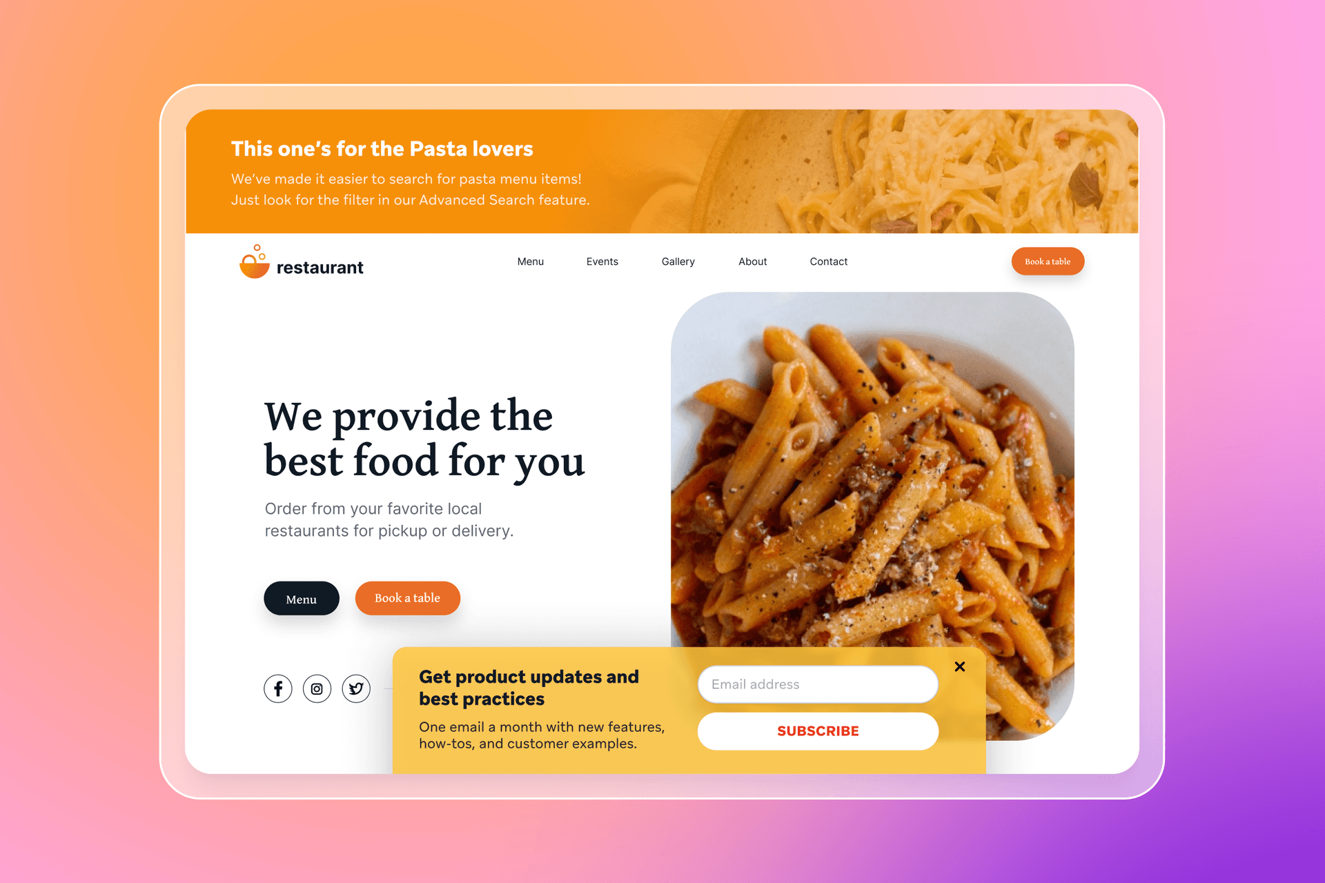
2. Pop-up forms
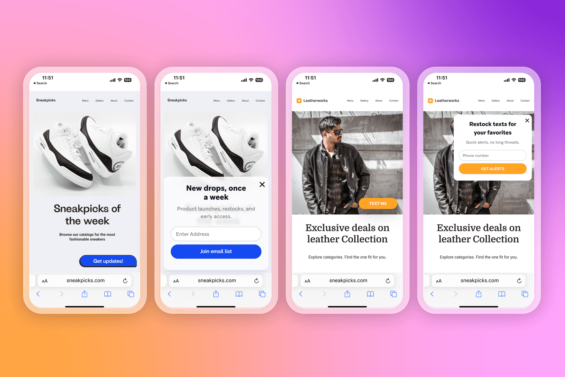
Format: A pop-up form appears in the middle of the page, usually with the site still visible behind it. The visitor can submit their details or close the pop-up and keep browsing.
Works best: In mid-intent moments like
- Homepages and collection pages once someone has had time to browse
- Blog posts and guides where the offer matches the content
- Product pages after a key action, like viewing multiple items
Intent and context: Pop-ups work when timing and targeting match why someone is on that page. A blog reader might respond to a guide or series. A product browser is more likely to opt in for a code, restocks, or early access.
Pros: Strong visibility without fully taking over the page—easy to notice, easy to engage with.
Cons: Easy to overuse—poor timing or repeated prompts can feel distracting.
3. Fly-out forms
Format: A fly-out form slides in from the side or corner of the page. It often starts as a small teaser or tab, then expands when clicked.
Works best: In lower-intent moments like
- Browsing sessions where you want a lighter prompt
- Content pages where you don’t want to block reading
- Repeat visits where the visitor has seen other prompts already
Intent and context: Fly-outs work when the offer is helpful, but the visitor is still exploring. They’re a good fit for softer value exchanges, like updates, education, loyalty, or back-in-stock alerts.
Pros: Low disruption—the visitor can keep browsing while deciding.
Cons: Lower visibility—weak offers can get ignored, and small CTAs can underperform on mobile if spacing is tight.
4. Embedded forms
Format: An embedded form sits directly on the page, such as in a footer, resource hub, blog sidebar, webinar registration page, pricing page, help center, account area, or a notification preferences screen.
Works best: In high-intent moments like
- Footer sign-ups for visitors who came looking for updates
- Resource hubs, guides, and content libraries where subscribing feels expected
- Webinar and event pages where reminders and follow-up matter
- Account or settings areas where people manage what they receive
Intent and context: Embedded forms work when the visitor expects them. They’re often found in places where someone is researching, subscribing to content, registering for something, or managing an account, which usually signals clearer intent than an interruptive pop-up.
Pros: Low-friction and trust-friendly—the form feels like part of the experience.
Cons: Lower visibility—embedded forms usually need strong placement or supporting prompts to drive volume.
What information should a sign-up form collect?
A sign-up form should collect the minimum needed to start messaging, then add detail later as trust builds. Every extra field adds friction and can reduce conversion rate.
Minimum viable data
Start with one contact method:
- Email address for onboarding, education, offers, and longer lifecycle messaging
- Phone number when SMS is the primary channel and you have a clear reason to text
If you want both, collect email first, then invite SMS as a follow-up step.
When to ask for preferences, interests, or demographics
Add questions only when the answers change what someone receives next. One preference question can be enough to improve relevance from the first message.
Good moments to ask:
- At sign-up, when one choice can route onboarding
- In the welcome journey, once someone has opted in
- In a preference center
- During account creation or checkout
Useful fields tend to be:
- Preferences and interests (categories, goals)
- Message preferences (email vs. SMS, content type, frequency)
- Use case (for themselves, gifting, replenishment)
- Demographics only when relevant and actionable
How zero- and first-party data supports personalization
Zero-party data is what someone shares intentionally, like preferences they pick on a form. First-party data is what you collect through your own channels, like browsing and purchase behavior. Together, they help you tailor onboarding early, then refine messaging with behavior over time.
Why more fields don’t always mean better results
More fields can mean fewer sign-ups and messier data. Every field should map to an action in lifecycle marketing, like a segment, a journey branch, a content block, or a trigger. If you can’t name the use, skip the field for now.
Mobile optimization for sign-up forms
Mobile is where many sign-ups happen, and it’s also where forms lose people fastest. Small screens leave less room for long copy, extra fields, and decorative design, so keep the offer clear and the first step easy to complete. Lead with the value in the headline, keep supporting copy to a single line, and use a CTA that matches the promise, like “Get the code.”
Design for thumbs and short attention spans. Stick to a single-column layout with large tap targets and generous spacing, and keep the first screen to one field. Use a multi-step flow only when you need a second channel opt-in or one quick preference. For pop-ups, avoid firing immediately on landing, use intent-based triggers like scroll depth or time on page, suppress repeat prompts in the same session, and keep visuals minimal so the offer stays front and center.
A good mobile form respects attention, delivers the value quickly, and gets out of the way.
Testing and optimizing sign-up forms over time
Testing keeps sign-up forms fresh and helps improve conversion rate without guesswork. Focus on a small set of variables, and change one thing at a time.
What to test
- Incentive type and value: Discount vs. free shipping, free gift vs. giveaway entry, gated content vs. early access
- Copy and CTA language: Headline, supporting line, CTA text, and how you set expectations on content and frequency
- Form length and steps: One-field vs. two-field, single-step vs. multi-step, plus whether one preference question improves downstream engagement
- Display timing and triggers: Time on page, scroll depth, exit intent, or after a key action like viewing a product or adding to cart
- Audience targeting rules: New vs. returning visitors, blog readers vs. product browsers, landing pages vs. sitewide, and category-specific targeting
What to track beyond submissions
Track list quality alongside form conversion rate:
- Welcome engagement: Opens, clicks, replies
- First conversion or first key action
- Early unsubscribes and complaint signals
How sign-up forms power better customer journeys
A sign-up form creates the first set of signals you can use to shape what happens next across lifecycle marketing.
- Data collected fuels segmentation and personalization by turning preferences and intent into attributes you can use to route messages, tailor content, and prioritize offers.
- Forms inform onboarding and welcome journeys so new subscribers get a first experience that matches what they asked for, instead of a generic sequence.
- Early signals improve relevance across channels by guiding whether you follow up in email, SMS, in-app, or push, and helping those touchpoints feel consistent as behavior changes.
How Braze can help brands turn sign-ups into engagement
Braze can help teams take what someone shares on a form and use it to drive timely, relevant engagement across the customer lifecycle.
- Unified data activation brings together sign-up attributes, preferences, and first-party behavior in a single customer profile, so teams can segment and personalize from the first message.
- Journey orchestration across channels makes it easier to coordinate email, SMS, push, and in-app messaging, so onboarding flows respond to what customers do next.
- Personalization and experimentation at scale supports testing different messages, paths, and timing, then using results to keep improving performance over time.
Key takeaways for sign-up forms
Great sign-up forms exchange clear value for consent, and they build trust early. Examples help spark ideas, but long-term growth comes from connecting opt-ins to personalization, experimentation, and lifecycle messaging that keeps improving over time.
A few points to leave with:
- Great sign-up forms exchange clear value for consent with transparent expectations around what subscribers will receive and how often.
- Examples inspire, but strategy drives results because intent, targeting, and timing matter as much as the design.
- Data collection should serve personalization so every field maps to a segment, a journey path, or a more relevant message.
- Testing and iteration unlock long-term gains by improving conversion rate without sacrificing subscriber quality.
Sign-up form FAQs
What is a sign-up form?
A sign-up form is a website element that collects an email address or phone number so a brand can communicate through owned channels.
What are the best sign-up form examples?
The best sign-up form examples match the offer to visitor intent, keep the first step simple, and collect data that improves personalization. Common high performers include discount offers, giveaways, and content-based opt-ins.
What information should a sign-up form collect?
A sign-up form should collect the minimum viable data needed to start messaging, usually an email address or phone number. Additional fields work best when they power segmentation and a more relevant welcome journey.
What types of sign-up forms convert best?
The sign-up form type that converts best depends on context and timing, not the format alone. Full-screen and pop-up forms can drive higher visibility, while fly-outs and embedded forms often feel more seamless.
How do sign-up forms support personalization?
Sign-up forms support personalization by capturing consent and data that can shape segmentation, onboarding, and lifecycle marketing. The preferences and behaviors tied to the opt-in can guide channel choice, content, and timing across the customer journey.
Related Tags
Be Absolutely Engaging.™
Sign up for regular updates from Braze.