Order confirmation emails best practices
Published on September 16, 2025/Last edited on September 16, 2025/11 min read


Team Braze
BrazeOrder confirmation emails are one of the most visible messages a brand sends. Triggered after a completed action—usually a purchase—they confirm key details and provide the clarity customers expect.
For eCommerce brands in particular, these transactional emails play a practical role. A good confirmation email reduces uncertainty, helps avoid support tickets, and reinforces trust at a key point in the journey.
In this guide, we’ll walk through what to include in an order confirmation email, how to design with purpose, and how brands across different industries use confirmation emails to support retention and customer experience.
Contents
- What is an order confirmation email?
- Why order confirmation emails matter
- What to include in a high-performing confirmation email template
- Best practices for confirmation emails
- Common mistakes to avoid in confirmation emails
- Examples of eCommerce confirmation emails (and other industries)
- How to turn a confirmation message into an engaging order confirmation email
- Orchestrating confirmation emails at scale
- Final thoughts about order confirmation emails
- FAQs about order confirmation emails
What is an order confirmation email?
An order confirmation email is a type of transactional message sent to confirm that a customer’s order has been received and processed. It’s triggered automatically after a purchase and typically includes key details such as the order number, item summary, billing and shipping information, and expected delivery timelines.
Unlike promotional emails, confirmation emails are functional by nature. But that doesn’t mean they should be overlooked. They’re often the most opened emails a brand sends—precisely because customers are actively looking for them. That makes them a vital touchpoint, especially in eCommerce, where transparency and reassurance are central to the post-purchase experience.
Why order confirmation emails matter
Confirmation emails serve as a digital receipt, a tracking hub, and a moment of connection all in one. Whether someone’s ordering a new laptop, subscribing to a meal kit, or booking a weekend away, the confirmation email is often the first step in delivering on your brand promise.
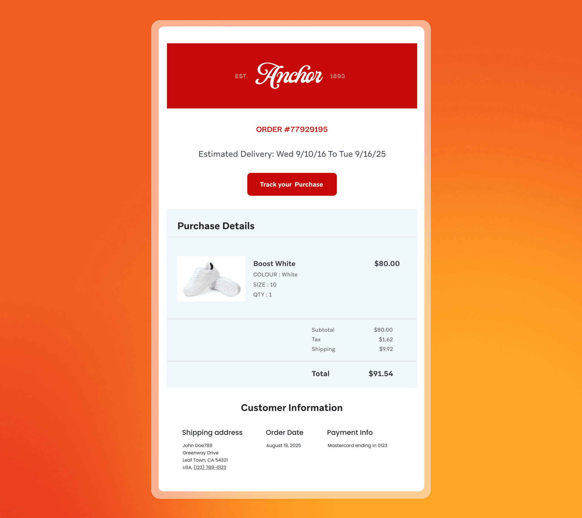
What to include in a high-performing confirmation email
Confirmation emails need to deliver key details without overwhelming the reader. The layout should be clean, the information easy to scan, and the tone consistent with your brand. Here's what to include:
- Confirmation message - A short line confirming the order was successful.
- Order number - Easy to reference if the customer needs support.
- Item summary - Names, quantities, and ideally, thumbnail images of each product.
- Pricing breakdown - Subtotal, shipping cost, discounts, tax, and total—spelled out clearly.
- Payment method - Include the last four digits of the card or payment method used.
- Billing and shipping addresses - These details help customers double-check for errors.
- Estimated delivery date - Or a clear note about when tracking will be available.
- Tracking link or next steps - Even a placeholder (“we’ll email when it ships”) is better than nothing.
- Customer support contact - A help button, email, or link to FAQs makes a big difference.
- Branding elements - Use your logo, brand colors, and a tone of voice that matches your other touchpoints.
This essential information gives your customer clarity and confidence in your brand. From there, it's worth thinking about how the experience can feel more polished, more intentional, and more aligned with the rest of your communication.
Best practices for confirmation emails
Speed and clarity come first. Customers want to know their order went through and what happens next. But there’s also value in how the message is written, designed, and delivered. A strong confirmation email feels consistent with your brand, easy to navigate, and—where appropriate—personal.
Send it straight away
Confirmation emails should be triggered in real time. The customer has just completed an action—they expect immediate acknowledgment. Delays create doubt and increase support tickets.
Keep the tone steady
Match the voice your brand already uses across marketing and support. That could be warm and conversational, or more minimal and direct. Either way, it should feel consistent.
Make it mobile-first
Most people will open this email on their phone. Use responsive design, short subject lines, and tap-friendly links.
Prioritize clarity
Use white space, hierarchy, and visual grouping to make the message easy to scan. Group similar information and keep paragraphs short.
Personalize where relevant
Include the customer’s name, reflect the items they purchased, or reference their delivery location. Even small touches help the email feel accurate and relevant.
Create room for subtle engagement
A confirmation email isn’t the place for a hard sell, but it can gently invite next steps. Consider adding:
- A link to leave a review
- A prompt to share on social
- A low-key recommendation or accessory
- A reminder of loyalty benefits or referral rewards
Track how your confirmation emails perform
Even though these are transactional messages, they’re still measurable emails—and the data can tell you a lot. Look at open rates, click-through rates, and timing to see how the message is being received.
For ecommerce confirmation emails, open rates are typically higher than promotional sends, which makes them a useful benchmark. If performance dips, it could point to delays, inbox placement issues, or subject line confusion.
Common mistakes to avoid in confirmation emails
Confirmation emails are straightforward by design, but that simplicity can lead teams to overlook key details. Here are some of the most common missteps, and how to avoid them:
Sending with a delay
Confirmation emails should land within seconds of the triggering action. Even a short delay can make customers question whether their order went through. That lag also opens the door to duplicate purchases or unnecessary support tickets. Use real-time triggers and check for bottlenecks between systems.
Skipping the subject line test
Subject lines like “Thanks” or “Order #12345” might seem functional, but they’re easy to miss in crowded inboxes. Aim for something clear and brand-aligned that reassures the customer at a glance. Example: “We got your order—here’s what’s next.”
Overcomplicating the layout
Trying to squeeze too much into a confirmation email—extra banners, product grids, heavy styling—can distract from the purpose of the message. Focus on clarity. Structure the content so it’s easy to scan on any device.
Missing or incorrect data
Dynamic fields that fail to populate, product images that don’t load, or mismatched names erode trust fast. Build in logic to handle errors (e.g., fallback values) and test templates regularly across scenarios.
Treating it as a marketing email
It’s fine to include a subtle product recommendation or referral reminder, but don’t push hard. The primary purpose is to confirm the transaction. Everything else is optional.
Examples of eCommerce confirmation emails (and other industries)
The most effective confirmation emails reflect the action being taken, the customer’s expectations, and the brand behind the message. While the core structure remains consistent—clear, timely, and easy to scan—each industry brings its own nuance
Retail & eCommerce
In eCommerce, customers expect clear proof of purchase, visual confirmation of what they bought, and delivery details they can refer back to.
What to include:
- A short confirmation message
- Item names and images
- Price breakdown (subtotal, tax, shipping, discounts)
- Estimated delivery date
- Tracking link or next steps
Example approach: A fashion brand might open with a simple thank-you, show product thumbnails with sizes and colors, confirm shipping info, and include a subtle referral link at the end.
Subscription services and on-demand
For recurring services—like subscription boxes, streaming platforms, or food delivery apps—the goal is to set expectations for what’s coming next, and when.
What to include:
- Confirmation of the current order or renewal
- What’s included in the subscription
- Billing summary
- Delivery or access timeline
- Links to manage preferences
Example approach: A meal kit service might confirm what’s in the upcoming box, highlight customizations, and include a CTA to skip or adjust the next delivery.
Travel and hospitality
Here, confirmation emails often act as digital itineraries. Customers rely on them for accurate logistics, cancellation terms, and easy access to key information.
What to include:
- Event or reservation details (date, time, location)
- Booking reference or confirmation number
- Directions or check-in info
- Cancellation or change policy
- Add-to-calendar link
Example approach: A boutique hotel might include booking details, room type, and check-in time—plus a note about nearby restaurants or optional add-ons like late checkout.
Health and wellness
From gym classes to telehealth appointments, confirmation emails in this space should focus on reducing no-shows and making the experience feel smooth and professional.
What to include:
- Appointment or booking time
- Location or access link
- What to bring or prepare
- Contact info for questions or rescheduling
Example approach: A yoga studio might confirm the class, location, and instructor, along with a cancellation window and a link to reschedule if needed.
Financial services
In this industry, clarity and accuracy matter most. Confirmation emails often reinforce account activity or transactional trust—whether it’s a payment, transfer, or profile update.
What to include:
- Summary of the action taken (e.g., payment amount, transfer details)
- Transaction ID or reference number
- Date and method of payment
- Contact details for support or security concerns
Example approach: A digital bank might send a plain-text style email confirming a transfer, with a downloadable receipt and a link to flag anything unexpected.
Media and entertainment
Whether confirming a subscription, a pay-per-view event, or a merchandise purchase, this category thrives on tone and brand voice.
What to include:
- Confirmation of access or purchase
- Event or release date (if applicable)
- Platform login or delivery info
- Recommendation for what to watch or read next
Example approach: A streaming platform might confirm account activation, share what’s trending now, and offer a curated playlist or collection to get started.
How to turn a confirmation message into an engaging order confirmation email
A confirmation email can do more than confirm an action. With the right timing and structure, it can also strengthen long-term engagement.
This is a natural moment to reinforce value—reminding customers what they’ve ordered, what to expect next, or where to get support. The focus should stay on clarity and service, but there’s room to guide the next step.
Personalization plays a key role here. Referencing a customer’s recent activity, preferences, or location makes the message feel accurate and considered. That consistency builds confidence over time.
With platforms like Braze, teams can use real-time customer data to adapt confirmation messages based on behavior or context—making follow-ups more relevant, support more useful, and the overall experience easier to trust.
Orchestrating confirmation emails at scale
Behind every confirmation email is a chain of connected systems—event triggers, message templates, customer data, and the infrastructure to deliver it all in real time.
At a minimum, you’ll need:
- A transactional email capability, often part of your email service provider (ESP) or customer engagement platform
- A trigger, like “order placed”
- Access to up-to-date order and customer data (e.g. item details, delivery address, customer name)
- A responsive, branded email template
- A way to preview, test, and troubleshoot before sending
For ecommerce brands, connecting these pieces across tools—your website, app, customer relationship management (CRM) software, order system, and support platform—can get complicated quickly. To keep confirmation emails accurate and on time, you need a system that supports both real-time data and coordinated journey orchestration.
Platforms like Braze help bring that structure together. By syncing live customer and order data across channels, teams can trigger confirmation emails instantly, personalize them based on context, and deliver a consistent experience at scale.
Final thoughts about order confirmation emails
Order confirmation emails may be transactional, but they still shape how customers experience your brand. When these messages are timely, well-structured, and consistent with your voice, they reinforce trust and reduce friction at a critical point in the journey.
By combining automation with real-time data and clear orchestration across systems, brands can deliver confirmation emails that feel seamless to the customer, and scalable to the team behind the scenes.
Treating these messages as part of your broader customer engagement strategy, not just a backend function, helps build a more reliable and connected experience—one message at a time.
FAQs about order confirmation emails
What is the goal of an order confirmation email?
The goal is to confirm that a customer’s order was successful. It provides key information—like item details, pricing, and shipping address—while reinforcing trust and reducing follow-up questions.
How can I make my confirmation email more engaging?
Use clear, friendly language and a clean design. Include relevant product imagery, personalized touches like the customer’s name, and optional extras such as support links or a review prompt to create a more engaging order confirmation email.
How to write an order confirmation email subject line?
Keep it short, clear, and brand-aligned. Examples: “Your order is confirmed,” “Thanks for your purchase,” or “We’ve received your order.” Subject lines for eCommerce confirmation emails should reflect the action and offer quick reassurance.
What elements should a high-performing ecommerce confirmation email include?
Key elements include the order number, product summary with images, pricing breakdown, shipping and billing info, delivery details, and support contact—all presented in a layout that’s easy to scan on mobile.
How can you use order confirmation emails to encourage repeat purchases?
Subtle follow-up cues—like product recommendations, referral rewards, or loyalty points—can support future engagement. Keep the focus on clarity first, then invite action with soft, relevant prompts.
Related Tags
Be Absolutely Engaging.™
Sign up for regular updates from Braze.
Related Content
 Article13 min read
Braze vs Salesforce: Which customer engagement platform is right for your business?
February 19, 2026 Article18 min read
Braze vs Adobe: Which customer engagement platform is right for your brand?
February 19, 2026 Article7 min read
Every journey needs the right (Canvas) Context
February 19, 2026